Project information
- Category: App design
- Client: Pawel Czerwinski (US Client)
- Project date: 08 March, 2021
- Project URL: www.figma.com
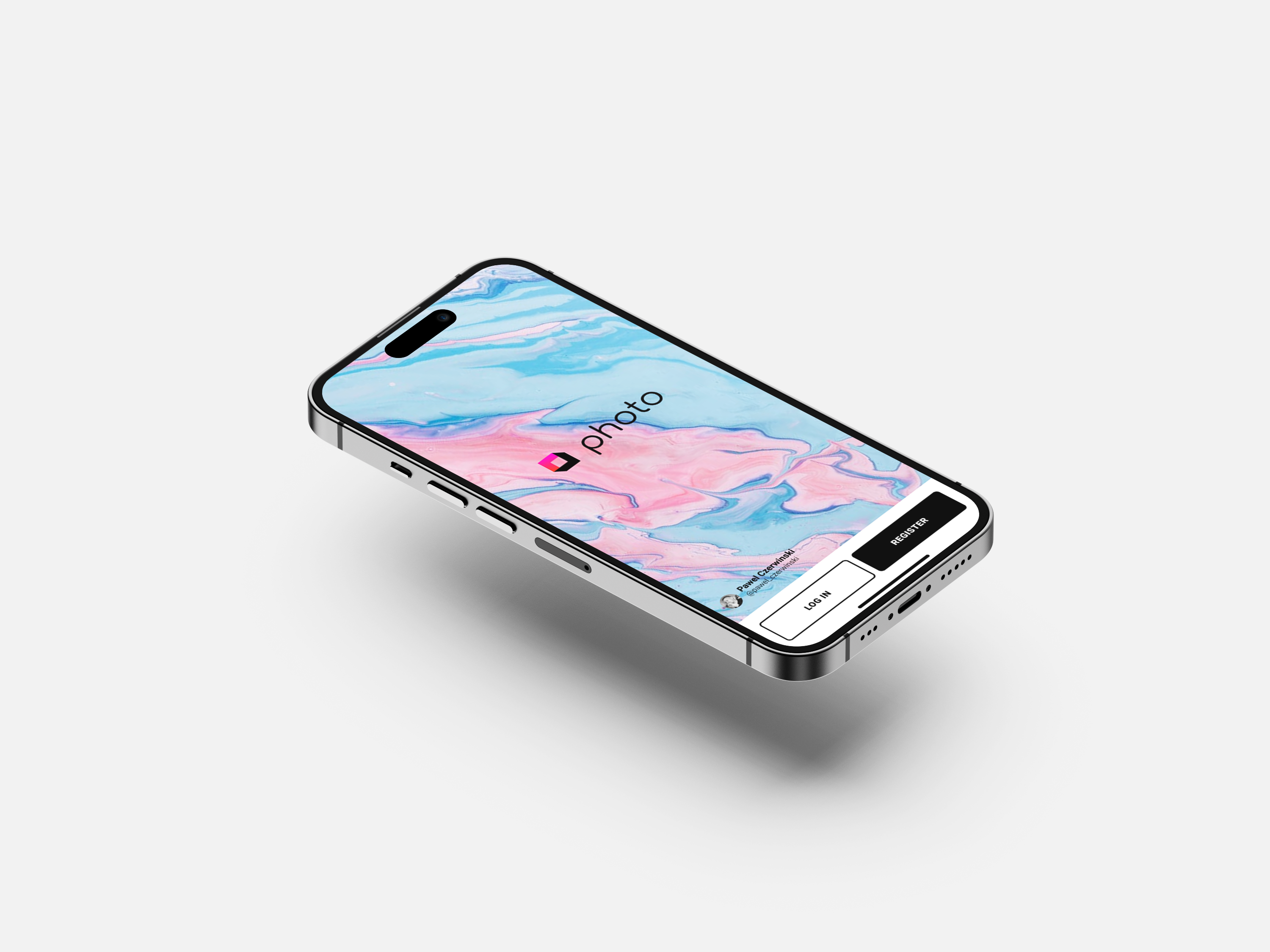
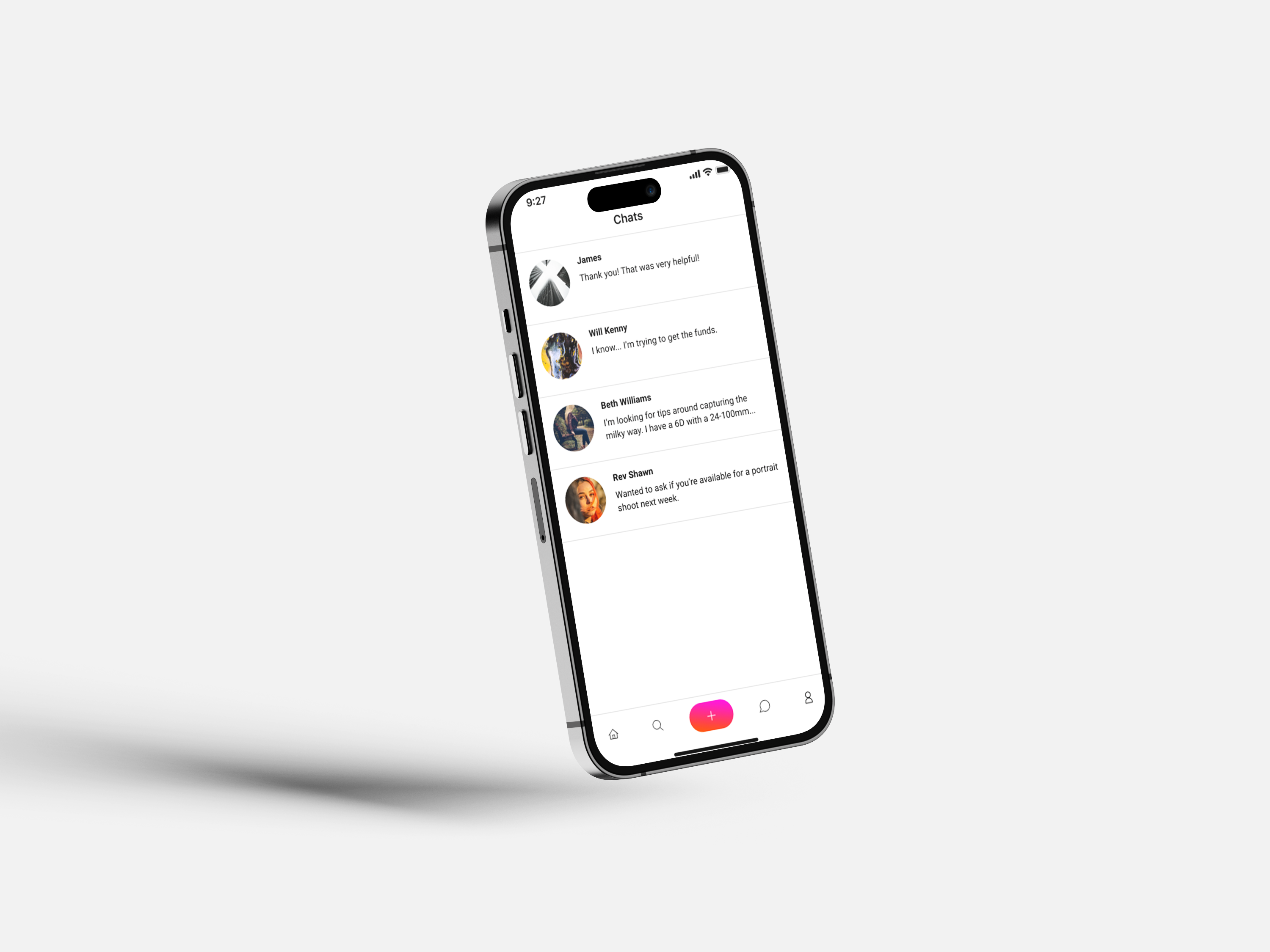
The Photo App UI/UX design project aims to create a visually appealing and user-friendly social media app where users can upload and share images, engage in chats for communication, and explore activities and images uploaded by others. Similar to Instagram, this app seeks to provide a seamless and immersive experience that fosters social interaction and content discovery.
User Research
User research was conducted to understand the target audience and their preferences when it comes to photo-sharing social media apps. The research provided the following insights: User personas: The main user personas include photography enthusiasts, travelers, artists, and social media influencers who have a keen interest in visually sharing their content. User goals and tasks: Users primarily aim to upload and showcase their photos, connect and communicate with others, discover new content, and gain visibility for their work. User flows: User flows were designed to outline the steps users take from registration to uploading photos, exploring the app, engaging in conversations, and discovering new content. Pain points and opportunities: Pain points, such as difficulty in discovering relevant content or inefficient communication features, were identified as opportunities for improvement.
User research was conducted to understand the target audience and their preferences when it comes to photo-sharing social media apps. The research provided the following insights: User personas: The main user personas include photography enthusiasts, travelers, artists, and social media influencers who have a keen interest in visually sharing their content. User goals and tasks: Users primarily aim to upload and showcase their photos, connect and communicate with others, discover new content, and gain visibility for their work. User flows: User flows were designed to outline the steps users take from registration to uploading photos, exploring the app, engaging in conversations, and discovering new content. Pain points and opportunities: Pain points, such as difficulty in discovering relevant content or inefficient communication features, were identified as opportunities for improvement.
Information Architecture
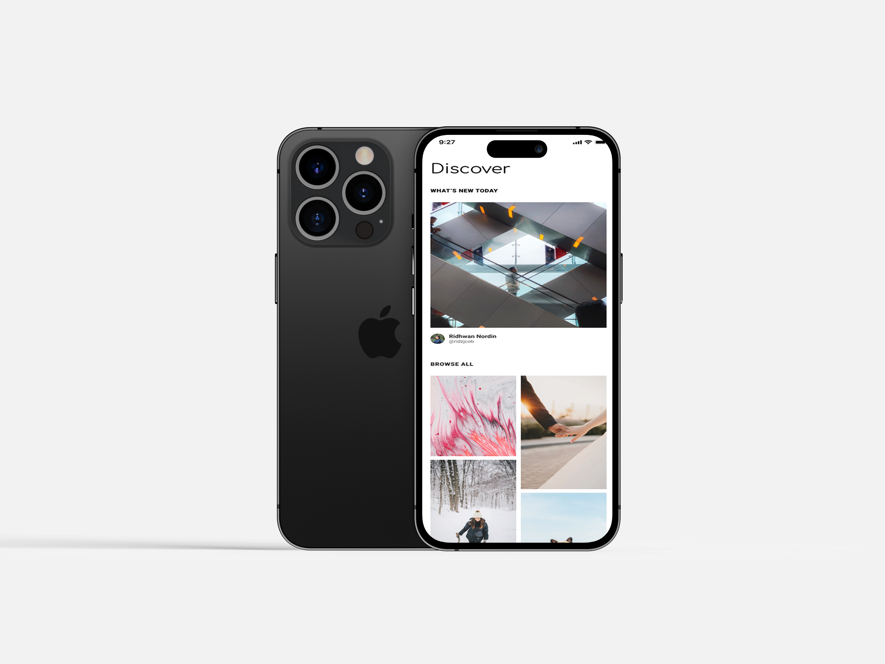
The information architecture of the Photo App was designed to ensure intuitive navigation and content discovery. Key elements of the information architecture include: Navigation design: The app features a bottom navigation bar that provides quick access to essential sections, such as Home, Explore, Upload, Notifications, and Chat. Content organization: The content is organized based on relevance, popularity, and user interactions. The Home section showcases personalized content, while the Explore section allows users to discover trending and recommended images.
The information architecture of the Photo App was designed to ensure intuitive navigation and content discovery. Key elements of the information architecture include: Navigation design: The app features a bottom navigation bar that provides quick access to essential sections, such as Home, Explore, Upload, Notifications, and Chat. Content organization: The content is organized based on relevance, popularity, and user interactions. The Home section showcases personalized content, while the Explore section allows users to discover trending and recommended images.
Wireframes and Prototypes
Wireframes and prototypes were created to visualize the layout and interactions of the Photo App. Key components of this phase include: Low-fidelity wireframes: Initial wireframes were developed to establish the basic layout, content placement, and functionality. This ensured a clear and consistent design structure. High-fidelity wireframes: Detailed wireframes were created to refine the visual design, incorporate branding elements, and align with user expectations. Interactive prototypes: Interactive prototypes were developed to demonstrate the user interactions and provide stakeholders with a realistic preview of the app's functionality and flow.
Wireframes and prototypes were created to visualize the layout and interactions of the Photo App. Key components of this phase include: Low-fidelity wireframes: Initial wireframes were developed to establish the basic layout, content placement, and functionality. This ensured a clear and consistent design structure. High-fidelity wireframes: Detailed wireframes were created to refine the visual design, incorporate branding elements, and align with user expectations. Interactive prototypes: Interactive prototypes were developed to demonstrate the user interactions and provide stakeholders with a realistic preview of the app's functionality and flow.
Visual Design
The visual design of the Photo App focuses on creating an attractive and immersive user experience that highlights the user-generated content. Key elements of the visual design include: Color palette: The color palette combines vibrant and eye-catching colors with subtle tones to create a visually pleasing and balanced environment that emphasizes the photos. Typography: Readable and modern typefaces are selected to ensure easy legibility of text-based content, such as captions and comments, while complementing the overall visual aesthetic. Imagery and icons: The app prominently features user-uploaded images using grids and carousels to showcase visuals. Custom icons are designed to enhance navigation and denote actions.
Color palette The visual design of the Photo App focuses on creating an attractive and immersive user experience that highlights the user-generated content. Key elements of the visual design include: Color palette: The color palette combines vibrant and eye-catching colors with subtle tones to create a visually pleasing and balanced environment that emphasizes the photos. Typography: Readable and modern typefaces are selected to ensure easy legibility of text-based content, such as captions and comments, while complementing the overall visual aesthetic. Imagery and icons: The app prominently features user-uploaded images using grids and carousels to showcase visuals. Custom icons are designed to enhance navigation and denote actions.
Typography
Font Family
Comfortaa
Aa Aa Aa Aa
Roboto
Aa Aa Aa Aa
Font Family
Comfortaa
Aa Aa Aa Aa
Roboto
Aa Aa Aa Aa